ShopDreamUp AI ArtDreamUp
Deviation Actions


Suggested Deviants


Suggested Collections


You Might Like…


Featured in Groups


Description
Not yet... Your nightmare is only just beginning...
--
MUAHAHAHAHAHAA!!
Yes!! I LOVE THIS PICTURE!!
Of course, I do love most all my pictures, but for this one I feel I must now pat myself on the back.
If I'm being a little too full of myself... oh, well. XD
YEEEEEEEEEEEE!!! I'm so proud of myself!! That background sure was daunting to look at when I first started.
But it turned out so great, I may have to start doing them more often.
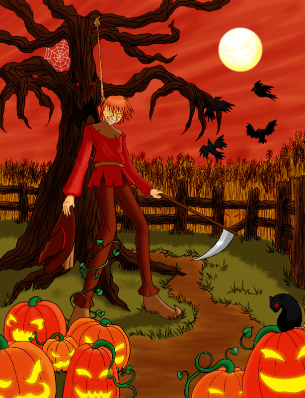
Of course, if you are lost when it comes to the content of this picture, this is a picture of one of my favorite Batman characters and a reacently accquired cartoon crush, Jonathan Crane, better known as The Scarecrow.
And here the viewer happens to be caught in one of his fear toxin-induced terrors.
BWAHAHAHA!!! *bricked*
I must say, this would make a great Halloween picture. But then again, it's Halloween every day for Scarecrow, isn't it? XD
Oh, and I drew him without his mask on. It attached to the hat if you can't tell.
I shamelessly admit it was mostly because I wanted to draw his cute face and that sadistic grin. XD
So anyway, I hope you guys enjoy!!
Let me know what you think!! XD
--
The Scarecrow and the Batman series (c) DC Comics, Bill Finger, and Bob Kane
--
MUAHAHAHAHAHAA!!
Yes!! I LOVE THIS PICTURE!!
Of course, I do love most all my pictures, but for this one I feel I must now pat myself on the back.
If I'm being a little too full of myself... oh, well. XD
YEEEEEEEEEEEE!!! I'm so proud of myself!! That background sure was daunting to look at when I first started.
But it turned out so great, I may have to start doing them more often.
Of course, if you are lost when it comes to the content of this picture, this is a picture of one of my favorite Batman characters and a reacently accquired cartoon crush, Jonathan Crane, better known as The Scarecrow.
And here the viewer happens to be caught in one of his fear toxin-induced terrors.
BWAHAHAHA!!! *bricked*
I must say, this would make a great Halloween picture. But then again, it's Halloween every day for Scarecrow, isn't it? XD
Oh, and I drew him without his mask on. It attached to the hat if you can't tell.
I shamelessly admit it was mostly because I wanted to draw his cute face and that sadistic grin. XD
So anyway, I hope you guys enjoy!!
Let me know what you think!! XD
--
The Scarecrow and the Batman series (c) DC Comics, Bill Finger, and Bob Kane
Image size
614x800px 594.79 KB
© 2010 - 2024 ShadOBabe
Comments155
Join the community to add your comment. Already a deviant? Log In
First, the colors in this are fantastic! I love the progression from bright to dim (front to back). It creates some awesome depth. The textures in the wheat field and the sky look amazing together too!
The only thing I would recommend working on in this piece is linework! Your linework is inconsistent throughout the piece. On the grass and the wheat you use these awesome tapered lines that give it life and action but the pumpkins, the tree, and scarecrow all kind of have either really thick (in the case of the tree) or really thin (in the case of the pumpkins and scarecrow) lines that aren't really adding to the picture. The tree especially seems a little lifeless compared to the rest of the picture (in regards to linework, of course).
Aside from the nitpicks, solid image. Keep up the good work!